The editor workspace
SCNX Sites is in active beta, and we're changing a lot of things as we go. We'll be reworking this documentation once the current beta cycle wraps up, so some details on this page may be outdated in the meantime.
The editor is a full-screen workspace where you build the content of your pages, style your site and publish it. Open it with Open editor on the Sites overview, or with Editor in the Sites section of your server's sidebar.
A few things live next to the editor, as their own entries in the sidebar: Pages for managing your pages, Navigation for your menu, plus Blog, Forms, Domains, Settings and Analytics. This page covers the editor, the Pages screen and the Navigation screen. See Your Sites section for the full list.
The layout
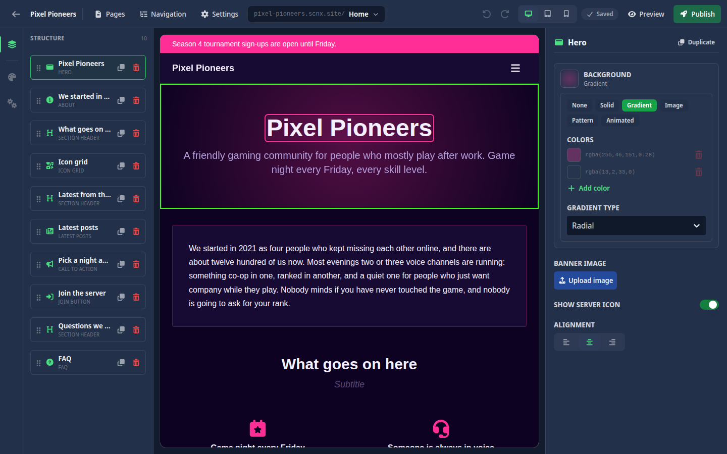
The workspace has a few regions:
- Top bar - the Back to the dashboard button, your site name, shortcuts to Pages, Navigation and Settings, the page switcher, the undo and redo buttons, the viewport toggle, the autosave state chip, a Preview button and the Publish button.
- Left strip - switches between the Structure list of the blocks on the current page and two site-wide panels: Design and Footer & bar. The panels slide over the structure list and never cover the page, so you see every change as you make it.
- Center canvas - a live preview of your page, shown with your real navigation bar and footer. Click a link in the preview's menu or footer to move to that page, just like a visitor would.
- Right panel - the options for whatever block you have selected. Most text is not edited here (see inline editing below). This panel holds the other settings like images, links, toggles, layout and backgrounds.
On smaller screens the structure list and the block options open as drawers, so the canvas keeps most of the space.
The page switcher
The page switcher in the top bar shows your site's address and the page you are editing. Click it to see every page with its address and jump to another one.
To add a page from here, click New page at the bottom of the list, enter a title and an address, and click Create page. The address follows the same rule as your site address: 3 to 63 letters, numbers and dashes, starting and ending with a letter or number. Pick it carefully, because a page address can't be changed later. blog is reserved for your blog, so no page can use it.
Once you have a published blog post, or your menu links to your blog, the switcher also lists Blog. It shows how your blog looks with your current design. You can't edit anything there; posts are written on the Blog screen. See Blog & announcements.
Pages
Open Pages in the sidebar (or from the editor's top bar) to see every page of your site. Each row shows the page title and address, its layout, and badges like Home for your home page and Nav hidden for a page without navigation and footer.
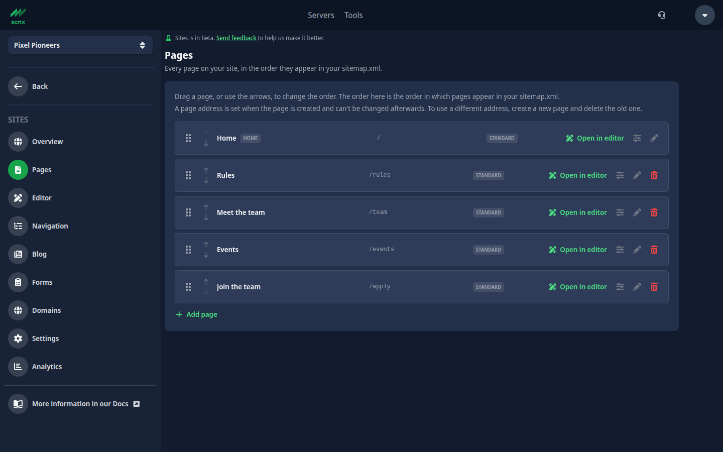
From here you can:
- Add page - the same title-and-address form as in the editor.
- Open in editor - jump straight into the editor on that page.
- Rename - change the page title. The address stays the same.
- Page layout - set the Content width to Standard or Compact (a narrow, centred column), and turn on Hide navigation and footer to remove the navigation bar, the footer and the announcement bar on that page only. The two settings are independent. This is how you build a link-in-bio page.
- Delete page - remove a page and its content. Your home page can't be deleted.
Your home page is always the page at /, the one visitors see when they open your site's address. You can't make a different page the home page. To change what visitors land on, edit the content of that page.
Drag a page, or use the arrows, to change the order. The order on this screen is the order your pages appear in your sitemap. It does not change your menu: you build that on the Navigation screen.
A page address is set when the page is created and can't be changed afterwards. To use a different address, create a new page and delete the old one.
Page changes, including the layout settings, reach visitors with your next publish.
Pages missing from your menu
A page that no menu item points to is easy to lose, because visitors can't click their way to it. The Pages screen marks those pages with a small broken-link icon ("No navigation item points here."). When there are any, a note above the list counts them, with an Add them to your menu link to the Navigation screen.
This is only a hint, never an error. It only checks your menu. A page you link to from a button somewhere else still gets the icon, and that is fine if it is on purpose.
Navigation
Open Navigation in the sidebar (or from the editor's top bar) to build the menu at the top of your site. You need edit access for this screen.
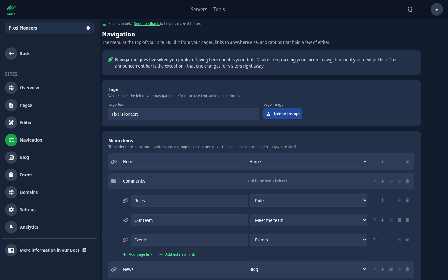
Logo
Logo sets what sits on the left of your navigation bar: Logo text, a Logo image from your server's image library, or both.
Menu items
Under Menu items you add three kinds of items:
- Add page link - links to one of your pages. Pick the page from the list. Under Built-in pages you will also find Blog, which links to your blog.
- Add external link - links to any other website. Enter a full web address like
https://example.com.mailto:andtel:links work too. External links open in a new tab. - Add group - a container that holds a few page links or external links. On a computer a group shows as a dropdown menu, and in the mobile menu it expands in place. A group does not link anywhere itself.
Every item needs menu text. The order on this screen is the order visitors see. Use the arrows to move an item up or down, and the indent buttons to move an item into the group above it or back out again. Groups can't hold other groups, and there is a limit on how many items fit at the top level and in each group. The screen tells you when you reach it.
Removing a group also removes the items inside it. Your pages are not deleted, only the menu entries.
Call to action button
Call to action adds an optional button at the end of your navigation, for example "Join our Discord". It needs both Button text and a Button link. Without either one it is not saved.
Saving and going live
Click Save navigation to save your menu. If something has to be fixed first, a Fix these before saving list tells you what, for example an item without menu text or a group that is over the limit. A Worth a look list shows things that won't stop you from saving but are probably mistakes:
- a group with nothing in it (it does not show up on your site),
- an item that points at a page that no longer exists,
- an external link that starts with a slash. That points at your own site, so use a page link instead,
- a link type your site can't open. Those items are left off your menu.
Saving updates your draft. Visitors see the new menu after your next publish.
Blocks
Pages are built from blocks. To add one, click a + in the structure list (or Add block on an empty page), or hover between two blocks on the canvas and click the Insert block bar that appears. Both open the block picker at that spot.
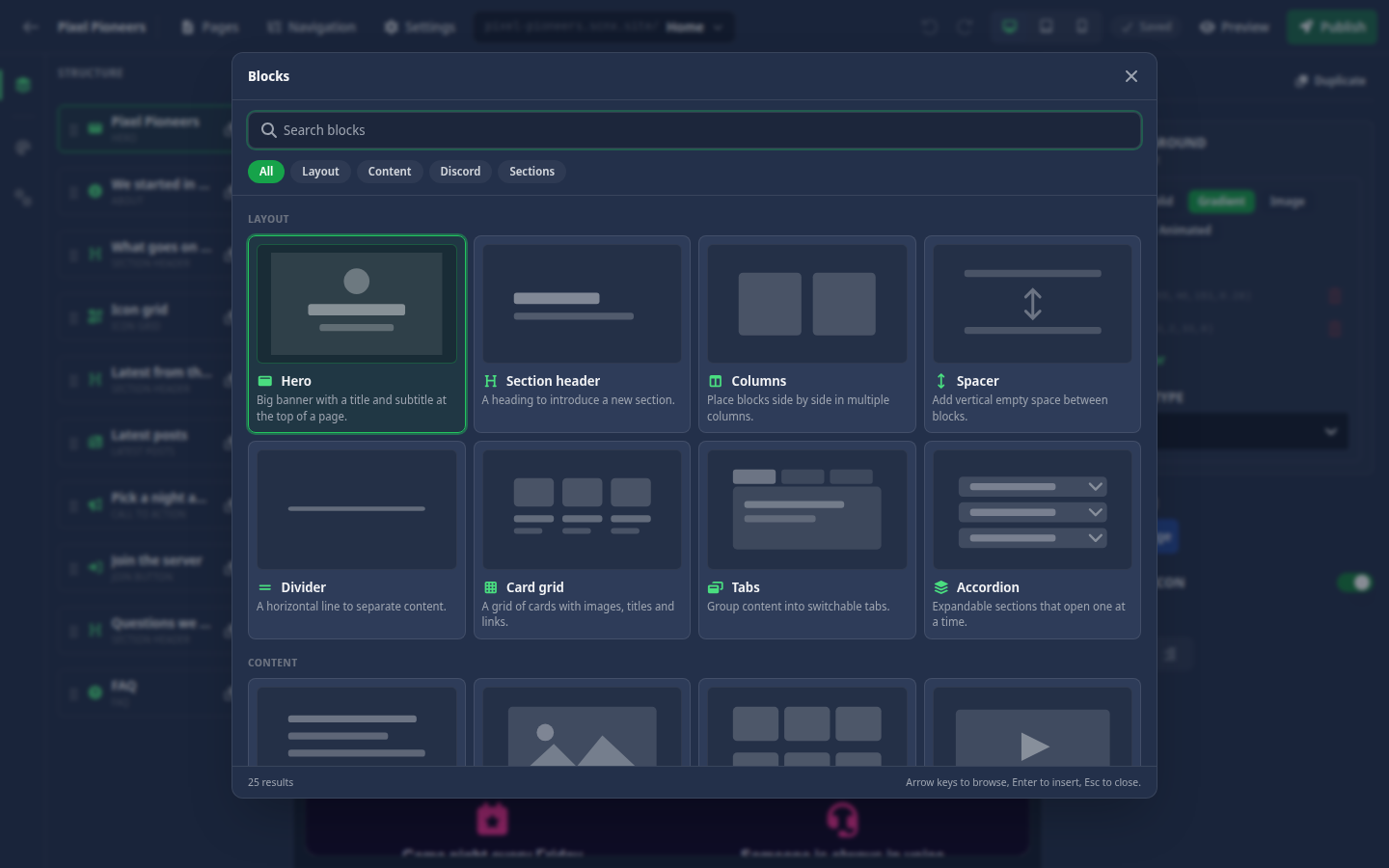
The picker has two tabs:
- Blocks - individual blocks, grouped into Layout, Content and Discord. Blocks you used recently show up under Recently used. The search field is ready as soon as the picker opens: type part of a name, use the arrow keys to browse, and press Enter to insert. Esc closes it.
- Sections - ready-made combinations of several blocks, inserted in one go. See Sections below.
Select a block on the canvas or in the structure list to see its options in the right panel. Duplicate makes a copy right below it, and Delete block removes it after asking you to confirm.
A block that is missing required information is marked Needs info, and a block that is empty and would show nothing on your site is flagged in the structure list.
Sections
Sections give you a whole part of a page at once. Every line a section adds is placeholder text, so click it on the page to rewrite it. Sections can only be added at the top level of a page, not inside columns.
| Section | What it adds |
|---|---|
| Welcome | A hero greeting and three reasons to stay. |
| About & team | Your story, followed by the people behind the server. |
| FAQ & contact | The questions everyone asks, and a way to ask the rest. |
| Rules & join | A numbered rule set with the join button underneath. |
| Highlights | Four short tiles for what your server offers. |
| Story & quote | Two columns: your story next to a member's words. |
| Getting started | Onboarding split across three tabs instead of one wall of text. |
| Closing call to action | How a page ends: a divider, one clear ask, one button. |
The block catalog
The Options column lists the settings you find in the right panel when the block is selected. Titles, labels and other text are edited on the page itself, so they are not listed here.
Layout
| Block | What it does | Options |
|---|---|---|
| Hero | Big banner with a title and subtitle at the top of a page. | Banner image, Show server icon (your Discord server's icon above the title), Alignment (left, center, right), Background |
| Section header | A heading to introduce a new section. | Alignment (left, center, right) |
| Columns | Place blocks side by side in multiple columns. Columns stack on small screens. | Gap between the columns: Small, Medium or Large |
| Spacer | Add vertical empty space between blocks. | Height (px), 32 by default |
| Divider | A horizontal line to separate content. | Style (Solid, Dashed, Dotted) and Color (Primary, Secondary, Accent, Border, Muted) |
| Card grid | A grid of cards with images, titles and links. | Columns, and per card an Image and a Link URL |
| Tabs | Group content into switchable tabs. | None, everything is edited on the page |
| Accordion | Expandable sections. | Allow multiple open lets more than one section be open at a time. When it is off, opening one closes the others. |
Content
| Block | What it does | Options |
|---|---|---|
| Text | A rich text block written in Markdown. | Background |
| Image | A single image with an optional caption and link. | Alt text (describes the image for screen readers), Link URL, Width (Small, Medium, Large, Full width) |
| Image gallery | Show several images in a grid. | Columns, and per image the Image and its Alt text |
| Video | Embed a YouTube or Twitch video. | URL, see Video below |
| Quote | Highlight a quote with an optional author. | Avatar, a picture shown next to the author |
| Call to action | A prompt with buttons to drive an action. | Buttons, each with a Link URL and a Style (Primary, Secondary, Outline), Background |
| Icon grid | A grid of icons with short labels. | Columns, and per item an Icon or an Image (see Icon picker) |
| Countdown | A live countdown to a date and time. | Target date, Expired message (shown once the countdown is over) |
| Form | An application or contact form people can fill in. | Form (which form to show), Thank-you message |
| Latest posts | Cards linking to your newest blog posts. | How many posts, 3 by default |
| Events | Upcoming Discord events from your server. | How many events, 3 by default, and Countdown to the next event |
Discord
| Block | What it does | Options |
|---|---|---|
| Join button | A button that invites visitors to your Discord. | Style and Size, see Join button below |
| Links | A list or grid of links. | Layout (List or Grid), Show icons, and per link a Link URL and an optional Icon image |
| About | A rich text block about your community. | None, everything is edited on the page |
| Staff team | Introduce your team members. | Layout (Default or Compact, which fits more people in a row), and an Avatar per member |
| Rules | A numbered or plain list of rules. | Numbered |
| FAQ | Frequently asked questions and answers. | None. Your questions and answers are also added to the page as FAQ data that search engines can read. |
Columns holds other blocks. Use Add column and the remove button to change the number of columns, and Add block inside a column to fill it. If you remove a column that still has blocks in it, those blocks move into the neighbouring column instead of being deleted. A Columns block can't go inside another Columns block.
Image fields (banners, covers, gallery pictures, avatars) use your server's existing image library, the same one your bot uses. An image link from anywhere else is rejected when you save, and the editor warns you about it first. Pick an image from the library instead.
Video
The Video block plays a YouTube or Twitch video right on your page. It needs the video's embed link: a special address the video site gives you for showing a video on another website. The normal link from your browser's address bar does not work here.
The URL field accepts these formats:
| Video from | What the link looks like |
|---|---|
| YouTube | https://www.youtube.com/embed/dQw4w9WgXcQ |
| YouTube without cookies (privacy-enhanced) | https://www.youtube-nocookie.com/embed/dQw4w9WgXcQ |
| A Twitch channel | https://player.twitch.tv/?channel=yourchannel |
| A Twitch video (a past stream) | https://player.twitch.tv/?video=1234567890 |
A YouTube embed link can also carry YouTube's own extras after the video ID, for example ?start=30 to start 30 seconds in.
Normal YouTube links like https://www.youtube.com/watch?v=dQw4w9WgXcQ or https://youtu.be/dQw4w9WgXcQ and normal Twitch links like https://www.twitch.tv/yourchannel are not accepted. If you paste one, the editor shows a warning under the field and the page is not saved until you replace it.
To get the embed link:
- YouTube - open the video, click Share, then Embed. In the code that appears, copy only the address inside
src="...". You can also build it yourself: take the video ID (the part afterwatch?v=or afteryoutu.be/) and put it afterhttps://www.youtube.com/embed/. - Twitch - for a channel, put the channel name after
https://player.twitch.tv/?channel=. For a past video, put the number from the video's address (twitch.tv/videos/1234567890) afterhttps://player.twitch.tv/?video=.
In the editor the block shows a placeholder instead of the real video. The video itself plays in the preview and on your live site.
Join button
The Join button sends visitors straight to your Discord server. There is no invite link to paste: when a visitor clicks the button, your server's bot creates an invite for them. If you have set a channel for your dcserver.link, the invite leads to that channel. Otherwise the bot picks a channel on its own. Invites made this way run out after a few hours, and a fresh one is made when needed, so the button never points to an old invite.
For this to work, your bot needs to be on your server and allowed to create invites. The button only works on your published site. In the editor, clicking it does nothing.
The button text is edited on the page. If you leave it empty, visitors see Join Server in your site's language. In the right panel you can set:
- Style - Primary, Secondary or Outline.
- Size - Small, Medium or Large.
If no invite can be created, for example because the bot is offline, not on your server or not allowed to create invites, visitors see "Couldn't load the invite. Try again." under the button. Nothing else on the page is affected.
Icon picker
Each item in an Icon grid can show an icon. Click the Icon field to open the picker, search for an icon by name and click it. None clears the icon. If you set an image on the same item as well, the image is shown instead of the icon.
Moving blocks
There are several ways to change the order of your blocks:
- Drag a block in the Structure list.
- Hover a block on the canvas and drag it by its handle, or use its Move block up and Move block down buttons.
- Select a block and press Alt+Up or Alt+Down.
Each move is one step you can undo.
Inline text editing
You edit text right on the page, not in a side panel. Click a title, a label or a paragraph in the preview and type. Press Enter to commit, Esc to cancel, or click away to save it.
Text that uses Markdown (the Text block, About, FAQ answers, tab and accordion content) works a little differently while you edit: Enter starts a new line, and a small floating toolbar gives you Bold, Italic, Link, Heading 2 and Heading 3. Click Done or click away to save.
Some blocks note "This block's text is edited directly on the page. Click it in the preview." That is the editor telling you where to click. A few texts only appear in a state the preview never shows, like a countdown's expired message or an image caption before the image is set. Those stay in the right panel.
Design and theme
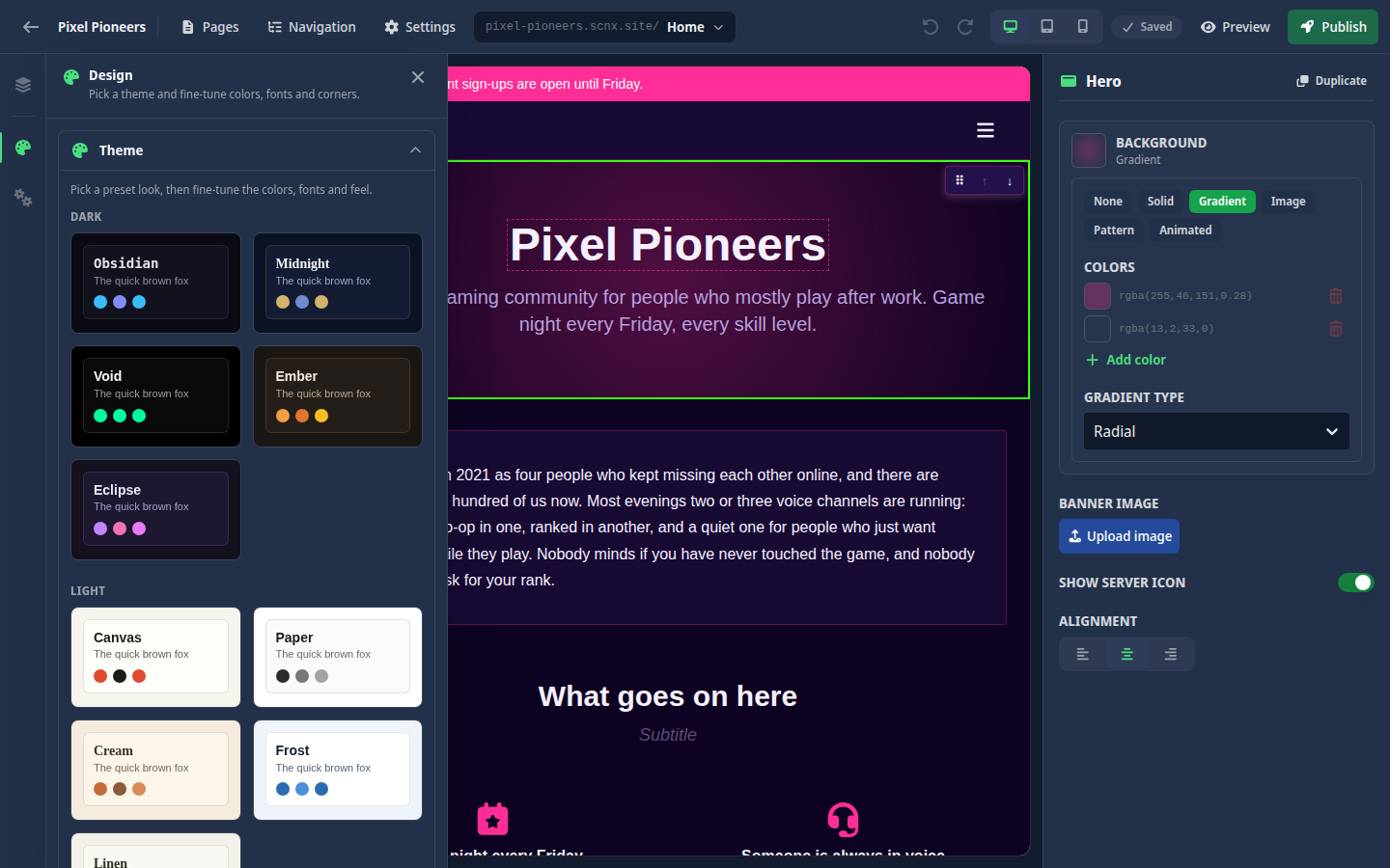
Open Design in the left strip to change how your whole site looks. Under Theme, pick one of the preset themes as a starting point. Themes are grouped into Dark, Light, Gaming, Creative and Premium. Then open Customize this theme to fine-tune:
- Colors - page background, surfaces, text, primary, secondary, accent, borders and dividers.
- Typography - heading, body and monospace fonts.
- Shape & feel - corner radius, spacing density and shadow style.
Every change re-skins the live canvas straight away, so you see the result as you go. Use Reset to theme default on any value to drop your change. The panel saves on its own, and your design goes live with your next publish.
Backgrounds
The Hero, Text and Call to action blocks have a Background option in the right panel. You can choose:
- None - the block uses your theme.
- Solid - one color.
- Gradient - two or more colors, linear or radial, in the direction you pick.
- Image - an image from your library, with a fit (cover, contain or tile), optional parallax scrolling, an overlay color and blur.
- Pattern - dots, grid, waves or diagonal lines in a color you pick.
- Animated - a slowly moving gradient of the colors you pick.
Footer & bar
Open Footer & bar in the left strip for the parts every page shares:
- Footer - Social links (pick a platform and paste the address) and extra Footer links, shown at the bottom of every page. The platforms you can pick are Discord, Twitter, YouTube, Twitch, Instagram, TikTok, GitHub and Website, and each shows as its icon. Only links that start with
https://orhttp://show up on your site. Footer changes go live with your next publish. - Announcement bar - a strip above your navigation for one short message. Unlike almost everything else, it goes live on its own, without publishing your site again. See Announcement bar.
Under your footer, every site also shows a small SCNX bar with a few fixed links. See Branding.
The site name, search and sharing, legal information and the other site settings are on the Settings screen.
Viewport preview
Use the viewport toggle in the top bar to preview your page at Desktop, Tablet and Mobile widths. All blocks are built mobile-first, and columns collapse to a single column on small screens.
If the live preview is unavailable, the editor drops into a fallback mode. You select a block from the list and edit everything, including its text, in the settings panel. Saving and publishing keep working the whole time.
Autosave
There is no Save button. The editor saves the current page on its own a couple of seconds after you stop typing. The chip in the top bar tells you where things stand:
- Saved - everything is stored.
- Saving… - a save is in progress.
- Needs attention - a save could not go through. Click the chip to see why.
"Needs attention" happens when a block is missing required information, when your text did not pass our automatic content review, or when we could not reach the server. Autosave for that page pauses until it is sorted, but your changes stay safely in the editor in the meantime. Fill in what is missing or fix the flagged text and saving continues on its own. If the server could not be reached, the editor tries again by itself, or you can click Try again now.
If you switch pages or leave the editor while a page could not be saved, the editor asks before it discards those changes.
Undo and redo
Use the undo and redo buttons in the top bar, or press Ctrl+Z to undo and Ctrl+Shift+Z (or Ctrl+Y) to redo. History covers the blocks and text of the current page and is cleared when you switch pages. Design and footer changes are not part of it. It only ever touches your draft, never your live site.
Preview
Click Preview to open your current draft in a new tab. Anything you have not saved yet is saved first, so the preview shows exactly what is on your screen. This lets you check a page before anything is published.
To share the draft with a teammate, use Copy preview link in the publish popover. Anyone with that link can see your draft. Reset link makes a new link and stops every link you shared before from working. Resetting needs admin access.
Publish and version history
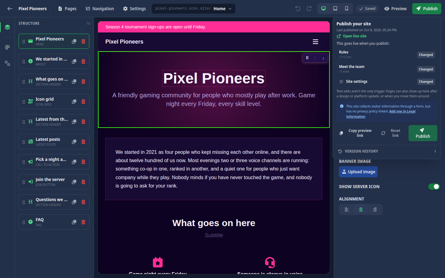
When your draft is ready, click Publish. Opening it saves anything still pending first, then shows exactly what will go live: a list of the pages that changed since your last publish (marked New, Changed or Removed) and whether your site settings changed. A page can also show up as changed after a design or platform update, or when you move pages around, so a long list is normal. Click Publish in the popover to go live.
A few things to know:
- If some blocks still need information, the popover tells you and publishing waits until you fill it in.
- If your site collects information through a form but has no privacy policy linked, the popover points that out. It does not stop you from publishing.
- If nothing changed, the button reads Published and there is nothing to do. Once your site is live, Open live site in the popover takes you there.
The same popover holds your Version history. Every publish is kept as a version (the last ten), and the one visitors see is marked Live. With admin access, you can Roll back to an earlier version to replace your live site with it. See Publishing & going live for the full picture of drafts and what goes live when.
View-only mode
If you only have view access to the site, the editor opens in View only mode. You can browse every page and open every panel, but editing is switched off, and the Publish button is replaced by Version history, so you can still see what was published when. To make changes you need edit access to the site. See Who can edit a site.
The editor is also view-only for everyone while SCNX has taken a site offline. A notice at the top explains what happened.